


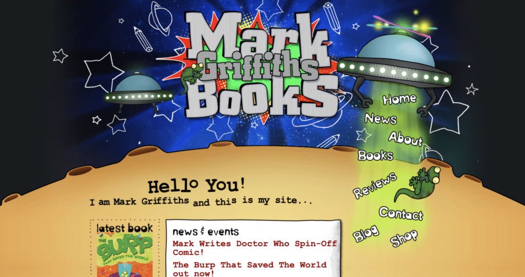
When designing your author website, remember that content is king. Author website design should be simple yet effective and never distract from the content.
Remember that first impressions count
Your visitors subconsciously form an impression of your website in just 50 milliseconds, according to a research study by Lindgaard et al. Of these first impressions, further research tells us that 94% are design-related. It’s therefore the design that reels in your visitors (and good content that makes them stay).
You have just 50 milliseconds to impress your website visitors. Make the most of it. Read '5 essential web design tips for your author website'. Share on XThink about what you want those first impressions to be. When a visitor snatches that first glimpse of your site, what do you want them to feel? Something like:
- trust (in you as a writer, as a person, or in the site if online payment or collection of personal data is involved)
- impressed (by the site, by your work)
- curiosity about you and your work
- relaxed/excited/scared (whatever best suits your genre!)
- all of the above
Once you know what impression you’d like to give via your author website design (remember, we’re talking about that very first impression in those first 50 milliseconds), think about the colours and layout that may give rise to that.
You can then mock up some test pages (homepage or other) and run them by some typical users to see which is more successful, or which your visitors will like the most. They may not even know why they like one more than another. It can be enough to know that it’s the most subconsciously appealing design to your target audience. This type of user testing could be done remotely using a mailing list if you have one.
Keep it similar…but different
The social psychologist Robert Zajonc once said, “The more familiar we are with something, the more we like it.” Ignoring that the opposite can also be true in other situations (“Familiarity breeds contempt”), let’s stick with Zajonc’s view for our web-design purposes.
While there is plenty of space in the world for crazy innovation and radical colour schemes, this is a risky strategy when applied to most websites. In the early days of the web, all manner of backgrounds, fonts and layouts were available, but the web playground has since settled down to a more mature approach (in most professional arenas, at least).
If you want your visitors to feel at home on your site, and to quickly find what they need, it is not a good idea to swim too hard against the tide when it comes to web design.
This doesn’t mean your site is doomed to be boring, or to look like every other author’s site, but it does mean there are certain conventions that your users will expect you to follow.
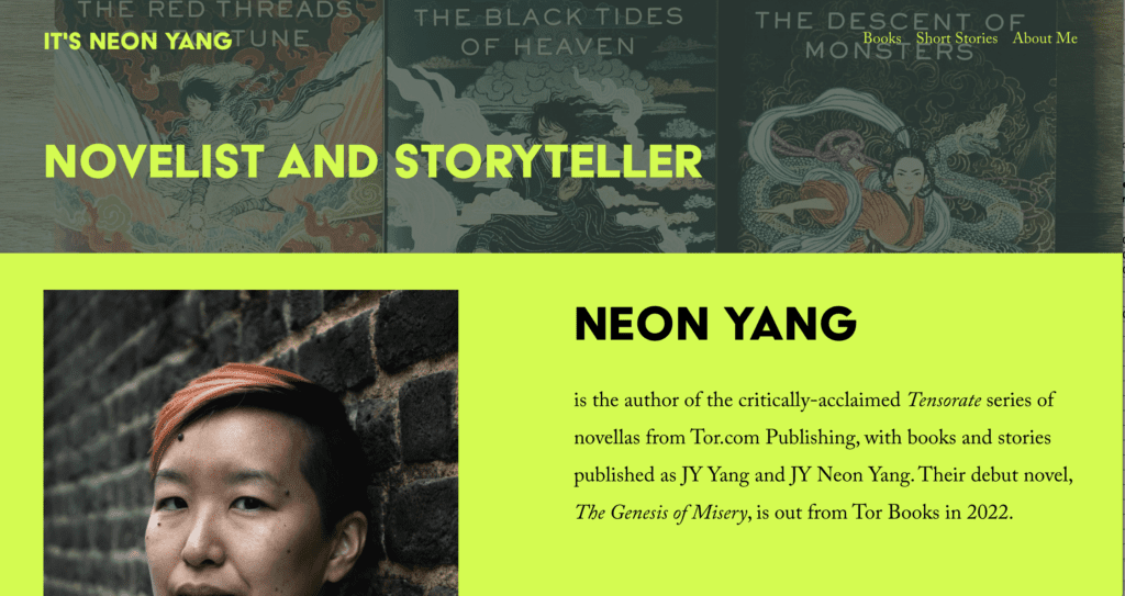
Use white space
White space doesn’t literally mean that the colour of the space on your page must be white. Also known as ‘negative space’, it refers to parts of your page where the background colour or background image show through.
White space = empty space, and that's a good thing when it comes to web design. Read why in '5 essential web design tips for your author website'. Share on XBefore the widespread use of mobiles and tablets, it was best practice to keep webpages short and to put crucial information above the fold (the point at which a user has to start scrolling). This often led to cramped, busy designs, where a lot was going on in a small space.
Since the explosion of tablet and mobile web browsing, and the wider variety of screen sizes that came with it, people are far more used to vertical scrolling (although horizontal scrolling is still a massive no-no).
This trend towards scrolling gives you freedom to use white space, and to allow your content to breathe. If your visitors are faced with a page crammed with content vying for attention, they will be overwhelmed and won’t know what to choose.
Keep it simple
As already mentioned, it takes your visitors just 50 milliseconds to form an impression of your author website. Therefore, it stands to reason that the simpler the design, the easier it will be for your visitors to absorb it.
A quick online search for ‘award-winning websites’ will further highlight the fact that simplicity wins.
To keep your author website design simple, try these tips:
- Use white/negative space – As mentioned earlier, this will keep your site looking ‘clean’ and give users the space to find what they’re looking for, or to see what you’d like to highlight.
- Remove redundant elements – You can pinpoint these in a number of ways, including:
- Try to look at your site through your visitors’ eyes. Which buttons, images, boxes, links are not of use or interest to them?
- If anything appears twice, remove one instance of it.
- Use a heat-mapping tool, or a click tracker, to see where your users’ attention is drawn the least. Then decide if this is because the item is in the wrong place, or if it can simply be removed.
- Don’t include unnecessary fancy elements – A spinning image of your latest book may seem the latest technological advance, but users will not thank you for it. These types of gimmicks can be distracting and annoying. They also add a complexity to your site that gives it a higher chance of breaking.
Make it responsive
Responsive design is about making sure your site functions well and looks good across as many browsers, platforms and devices as possible.
This is increasingly a bigger and bigger deal. Google favours sites that work on mobile over those that don’t. Responsive design also spans other areas of web best practice, such as SEO (search engine optimisation).
A quick reminder of terminology before we go any further:
- Browser – the application you use to look at webpages, eg. Chrome, Safari, Firefox, Edge
- Platform – this has a wide definition. For our purposes here, it refers to the operating system used to access the internet, eg. Linux, Microsoft Windows, macOS/iOS (Apple), Android
- Device – the physical equipment used to access webpages, eg. desktop/laptop, tablet, mobile
Mobile-first
If you take nothing else away from this post, remember one point: ensure your site works correctly on mobile. Why? Here are two massive reasons, amongst lots of little ones:
- Mobile devices have the largest share of global web traffic (over 50%), and more than two-thirds of the world’s population now own a mobile phone. Wearesocial.com’s Digital 2022 report tells you more.
- Since March 2021, Google takes a ‘mobile-first’ approach to crawling your site. If your site has a separate mobile version, it will tend to use that for indexing and ranking your site. Your desktop version may not get a look-in. Far better to ditch any separate mobile version you may have and maintain just one version that is fully responsive. If you must maintain a separate mobile version, ensure that the content on both site is identical.
You can check whether your site is mobile-friendly in just a few seconds, by entering your URL on the Google mobile test page. If it says your site is mobile-friendly, congratulations! However, it isn’t the end of the road, as pages may still not be displaying 100% correctly.
Nothing beats basic user testing – check your site on your own mobile. If your friends have a different handset to you, ask them to check too.
Know what your site visitors are using
If you are tracking your site traffic, eg. using Google Analytics, it is easy to find out the main browsers, devices and platforms that your visitors are using. These are the ones you need to concentrate on and ensure your site is compatible with.
To find them in Google Analytics:
- In the menu, go to Audience > Technology > Browser & OS (‘OS’ stands for ‘operating system’)
- You will see a list of browsers, and options across the top of the table to also view operating systems, screen resolutions and more.
- If you click on a browser or OS, you can see the versions being used.
- Now go to Mobile > Overview in the Analytics menu, to see a breakdown by device (desktop (this includes laptop), mobile, tablet).
- In the menu, select Devices to see a breakdown of mobile devices used to access your site.
This is juicy information you can use to improve your site. Use it to narrow down which browsers and devices to concentrate your testing on.
There are online tools to check your site across different browsers and devices. Some of these are free, others offer a free trial period. Search on “cross browser testing” to find one you like.
Over to you
Share a link to your author website in the comments, and let me know about the decisions you made to arrive at your particular web design. Let’s see those cool designs!
One last thing: I offer a couple of services for websites. These involve checking your web content not only for errors but also looking at it through a lens of SEO, accessibility and web best practice:
If you’re interested in finding out how I can help you, get in touch!


Kimberly de Witte
I’ve just launched my author website, http://www.kimberlydewitte.com, in the new year. I hired a web designer who happens to also be a writer, which was a great choice. He coached me around leaving negative space (I have to continually remind myself that people scroll!) and showing enough of myself and my novel I’m submitting for queries.
Debbie Emmitt
Hi Kimberly, I love your site. The negative space really makes a difference and helps the reader’s eye to glide through the content. I can feel your words breathe! Your site is also easy to get around, the meaning of each menu item is clear and I like the friendly call to action on your homepage (Let’s Keep in Touch). Congrats on a great site!
Cloudi5 Technologies
Great Tips. Thank you for sharing this amazing Information with us !